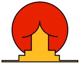
Am I missing what that is supposed to be? I'm apparently not seeing what the designers were trying to do. Needless to say, it won the competition.
See 18 more here.
EDIT: Since RobG didn't get it ... click the link to see company logos that look like they have penises in them. Wow, Rob.
1.29.07 - 9:40 p.m.

No comments:
Post a Comment